✽ TedxUofW Crossroads
Designing for the brand identity of our annual Spring TEDxUofW conference
Time
Fall 2023 -
Winter 2024
12 weeks
Team
Madelyn Lee
Stephanie Chou
Ronan Pitzel
Michelle Nguyen
Eddy Peng
Skills
UI/UX Design
Brand Design
Design Systems
The theme Crossroads represents the intersection of ideas, the overlapping of concepts, and the reflection that can come when we are faced with a dilemma.


Process
MOODBOARDING
For us, visualizing Crossroads felt like seeing the aurora borealis.
Scientifically, the aurora borealis The aurora borealis is made up of multiple waves of light interacting and intersecting each other to create moments of "epiphany."
Visually, the way the aurora colors blend and overlap felt symbolic of how ideas come together to form something new and beyond imaginable.

LOGO
Translating the aurora borealis in a clear, simple way.
In each of my logo revisions, I wanted to explore intersecting lines or gradients that mimic the movement and fluidity of the aurora.
I wanted to play around with lots of waves, bends, and softer lines—however, feedback included legibility, which meant I had to find a balance between simplifying the logo while still keeping the original inspiration in mind.


COMPETITIVE MARKET RESEARCH
We researched how other conference websites:
Structured their information architecture, such as speakers, schedule, sponsors, and ticketing.
Utilized visual design and branding and how they incorporated their conference theme into visual elements like color schemes, typography, and imagery.
Enhanced user engagement through interactive elements such as countdowns, speaker videos, and ticket purchase buttons to understand how other TEDx sites motivated visitors to take action.

INFORMATION ARCHITECTURE
Based on this research, we mapped out how the user would access the information on the website.

USER TESTING
With a few design iterations, we conducted A/B testing and usability testing to finalize our design solutions.
Participants preferred the Static Cards over the Carousel Cards because:
It was difficult and not as intuitive to drag to scroll horizontally.
Participants wanted to see the information displayed statically without anything cut-off for optimal reading experience.
Additional feedback: the backgrounds of the cards were too distracting and made it hard to read the text, so we moved information under the images.
We added an additional scroll for each section to decrease the cognitive load and avoid overwhelming users with information.

DESIGN SYSTEM
We based our design system on our brand identity and logo, following the aurora borealis as a source of influence.

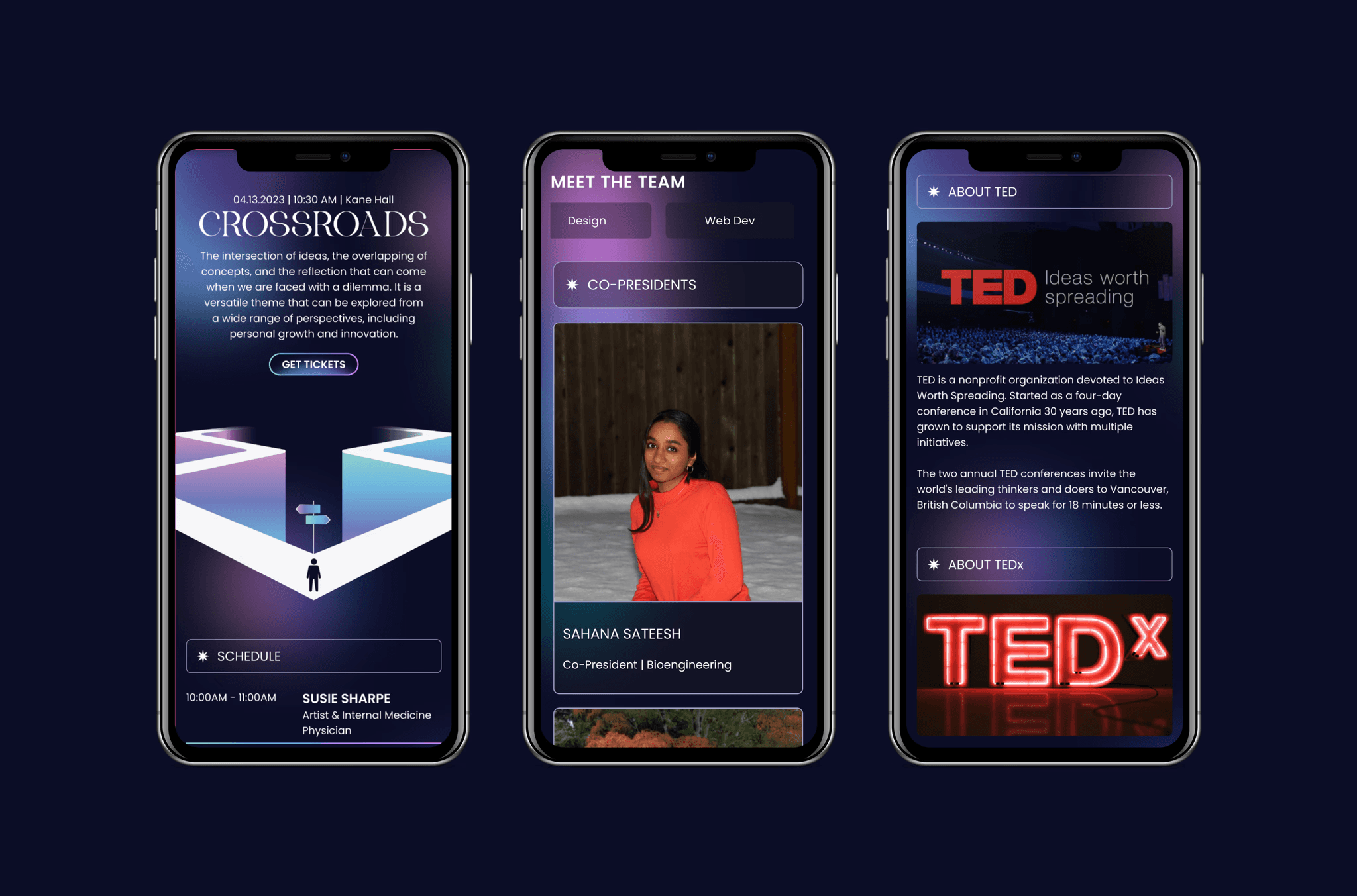
FINAL DESIGN
Crossroads: when ideas intersect and create reflections and change.
LEARNINGS
The most important lesson I learned was how to work within and across teams under tight deadlines.
This was my first project using Figma extensively, so learned and grew from the different design skillsets each member had.
The biggest challenge I faced was learning how to work alongside a software development team, understanding what was feasible within a timeline. A lot of our ideas were unable to be implemented based on the developers' workloads. Because of the timeline restriction, we were also unable to spend as much time on low-fidelity wireframing and iterations.
