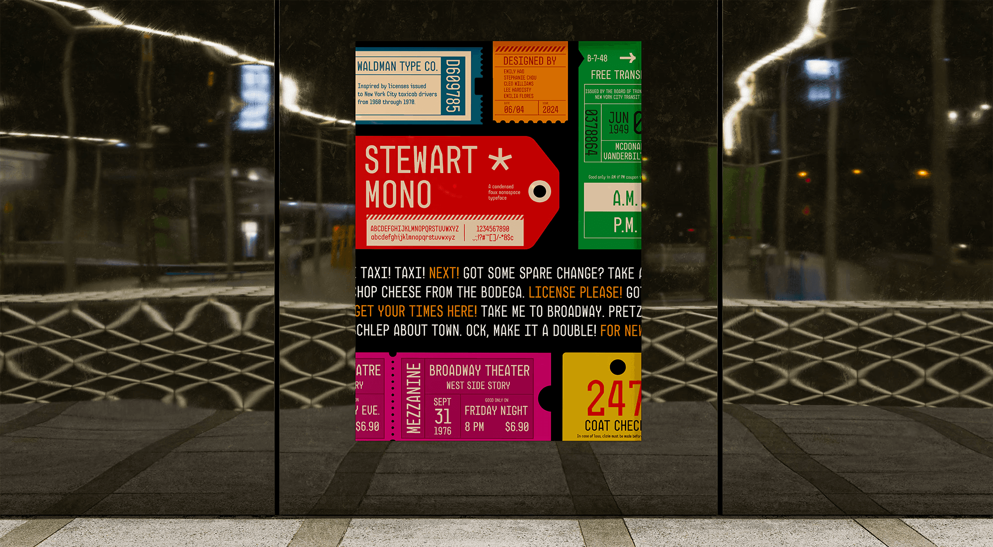
✽ Stewart Mono
A condensed faux monospace typeface
Client
Karen Cheng
Time
Spring 2024
10 weeks
Team
Emilia Flores
Lee Hardisty
Stephanie Chou
Cleo Williams
Skills
Type Design
Poster Design
Stewart Mono is a utilitarian and bureaucratic typeface inspired by New York City taxicab licenses of the 1960s and 70s. Its practical, time-worn character makes it a versatile choice, capturing the gritty, urban qualities of its roots.

Process
PROMPT
Design a typeface based on a photo.
Our team was tasked with designing a typeface inspired by a singular image of Stewart Waldman's 1966 Taxicab Driver's License.
The distinctive angular feature of the capital letters served as a pivotal point of reference, as we imagined and designed the rest of the alphabet.

RESEARCH
We looked to other similar condensed, monospace typefaces.
Before creating a new typeface, we researched other similar typefaces to not only draw inspiration from, but to also look for gaps in the range of typefaces that are similar to ours.

MOODBOARD
Guiding our group towards a consistent vision for the typeface and poster.
The five of us each created a mood board that communicated the desired personality of the typeface, and any possible applications where the typeface would be appropriate (brands, packaging, signage, posters, advertisements, etc.).
We wanted Stewart Waldman's typeface to reflect bureaucratic and seasoned personality, and this typeface would most likely be used as stamps on vintage prints, such as tickets.

IDEATION + ITERATION
Iterate, critique, repeat.
From sketching with Sharpie on Vellum to learning Glyphs, each of us brought in variations of our assigned letters each class for critique. A constant process of iteration allowed our typeface and poster to progress and become cohesive in style and personality.


FINAL DESIGN
Stewart Mono: a vintage, condensed, faux-monospace typeface

LEARNINGS
Creating a typeface is hard. Collaborating is harder.
I learned details matter. While they may seem so small and negligible, each little detail is what gives a typeface its personality. This project has trained my eye to become detail-oriented, to see value contrast in type, and to understand spacing.
To have five different designers work on a single typeface was a challenge; it was a struggle to make sure our assigned letters looked cohesive as one set. But, week after week, the variability within our typeface and the amount of design decisions we needed to make decreased.
