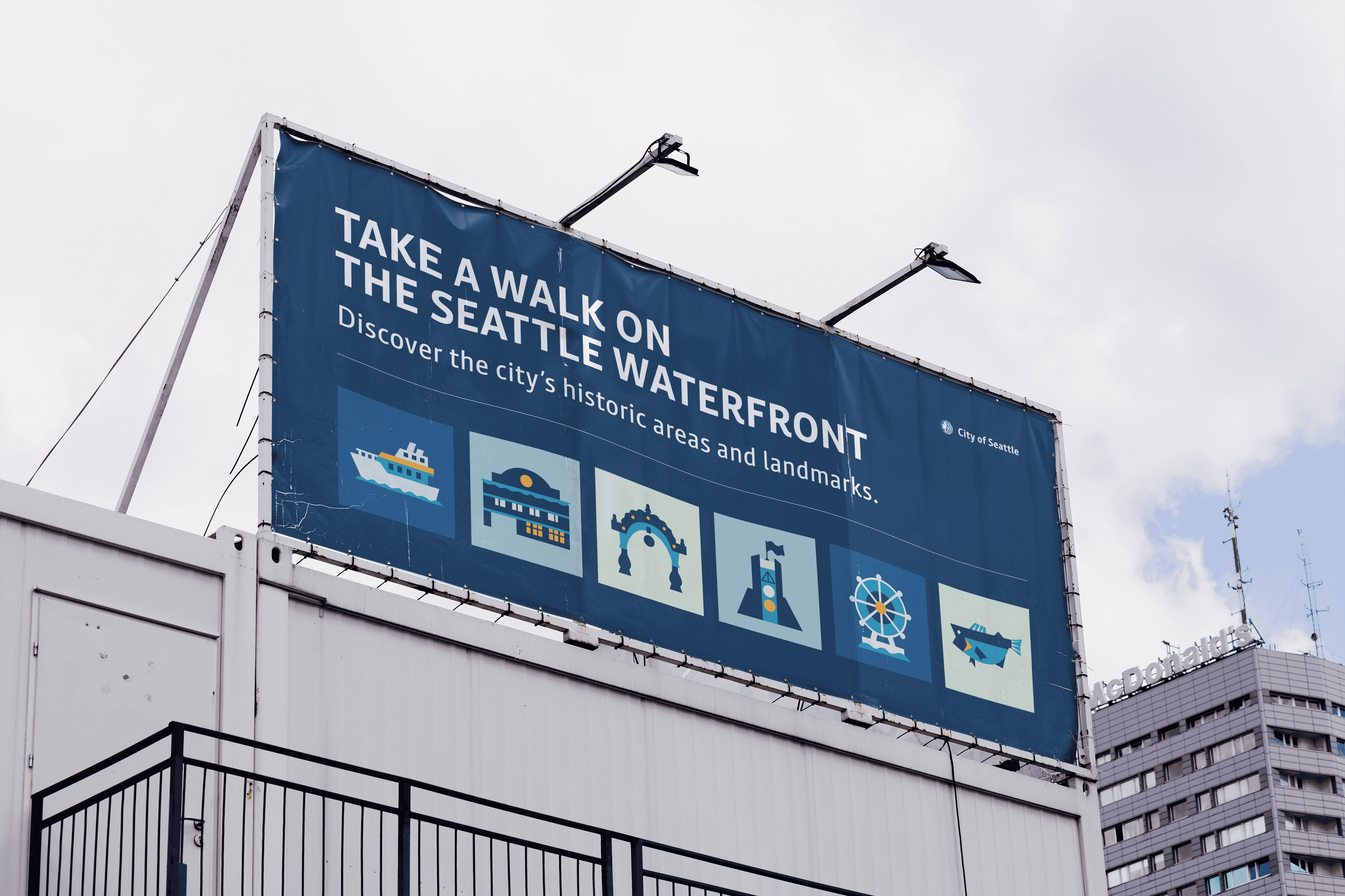
✽ Seattle Waterfront
Encouraging residents to explore the Waterfront's
iconic & historic neighborhoods
Client
City of Seattle
Time
Spring 2024
5 weeks
Skills
Symbols Design
Poster Design
This Seattle Waterfront symbols set is designed for (unofficial) promotions of the Waterfront Seattle project which recently renovated the Waterfront by building new streets and parks. Additionally, this sets supports simpler symbols created for accessible wayfinding and signage.
The set highlights the Waterfront's iconic and historic neighborhoods by using a gridded yet friendly visual language, encouraging Seattle residents to explore and take a walk on the newly renovated Seattle Waterfront.


Process
PROMPT
Design a cohesive symbols set based on the Seattle Waterfront.
The Waterfront Seattle project is a comprehensive redevelopment initiative aimed at transforming Seattle's central waterfront neighborhoods into a vibrant, accessible, and sustainable public space.

RESEARCH
I researched the significance and landmarks of each Waterfront neighborhood.
Before ideating on a symbols set, I researched what symbols already exist for each Seattle Waterfront neighborhood. It turned out, the Instagram page already had a symbols set in-use that I could reference and improve upon.
At this stage, it was also important to keep in mind the possible applications of these symbols to guide my design directions.

IDEATION
Thinking big with 3 black-and-white variations to determine direction.
I made three initial rough drafts using black and white marker by hand, showing the symbols both large (~5" square) and small (~1” square) to test scalability.
The goal was to narrow down on a visual direction for further development.

ITERATION
Developing and unifying visual structure.
To develop my symbols further as a set, I iterated how my symbols' visual structure can be made uniform by experimenting with consistent containers, different line weights, shape languages, and color palettes.
This was done alongside poster development, which responded to the application of the symbols.


LEARNINGS
I struggled the most with color.
Much of my critique and feedback for weeks concerned my poster's lack of value contrast. However, just being able to bring something new each week helped me reach a breakthrough, discovering a working color palette.
As for application, I enjoyed the process of seeing my poster development from a simple map idea. Because Seattle is such a gridded city, it made sense for my design to embrace the grid.
Thank you to my TAs Naomi-Pleasure Park and Burke Smithers, as well as Professor Karen Cheng.
