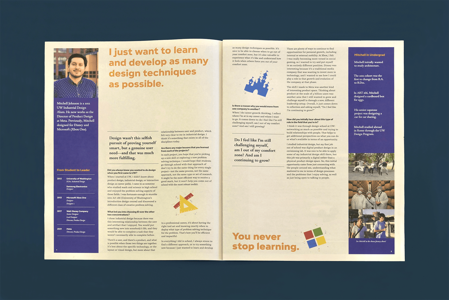

Mitchell Johnson’s nearly decade-long career as a design leader has focused more on strategy rather than hands-on design work—how do I create an visually engaging and fun eight-page newspaper that showcases his insights without being able to rely on many visuals from his archived past projects?


Bringing liveliness and delight with spot illustrations


Breaking down Mitchell's extensive career
It made the most sense to structure my design into three sections:
Introduction, Design School & Transition to
Industry
Designing for Microsoft, Walt Disney, & Meta
Advice for Design Students


Translating from tabloid to a digital experience
To keep the interview engaging digitally, I animated the spot illustrations as floating and included gifs of his work, staying true to my original tabloid design while taking advantage of the screen medium.

01. Interview Tags
Interview Tags enable users to find interviews within a specific category that they're interested in more easily.
02. Search and Filter
Search & filter tools help users to quickly search for interviews.
03. Connect Back to UW Design
The site is designed to help inspire prospective and current students to also easily find information about the UW Design program.
PROMPT
Design a tabloid publication that feature an interview with a professional designer.
I wanted to interview a product designer who had worked in entertainment, so I decided to interview Mitchell Johnson.

IDEATION
I wanted a professional, sleek look that reflected Mitchell's career breadth and background as an industrial designer.
The feedback I received on my covers and initial drafts was that they were too boring and didn't reflect Mitchell's personality.
Mitchell wasn't a business analyst or working in finance — he chose to work in the entertainment industry, so I my cover needed to reflect that.


ITERATION
Pivoting to color and illustrations!
My breakthrough in this design was inspired by Mitchell's work themselves: colorful, playful, and fun. I experimented with spot illustrations to help break up the text and add visual interest throughout the spreads.


REFLECTION
Breakthroughs can happen — it just takes time and a little bit of sweat.
Throughout this project, I struggled to design for a designer who is now more of a strategist rather than a visual person. This meant that I didn't have much of a sense of Mitchell's work or personality through his work, and so I had to find other ways to make my design visually compelling.
Special thanks to Professor Karen Cheng for critique and Mitchell Johnson for all the advice I learned.


